About the Project
Textured synthesized sound of pioneering electronic music, oscillated waveforms changing shape, text-rich technical synthesizer manuals—these are the foundational sources of inspiration for Primitiv Text, a new type family created across Term 2 and Term 3 of Type West through the Letterform Archive.
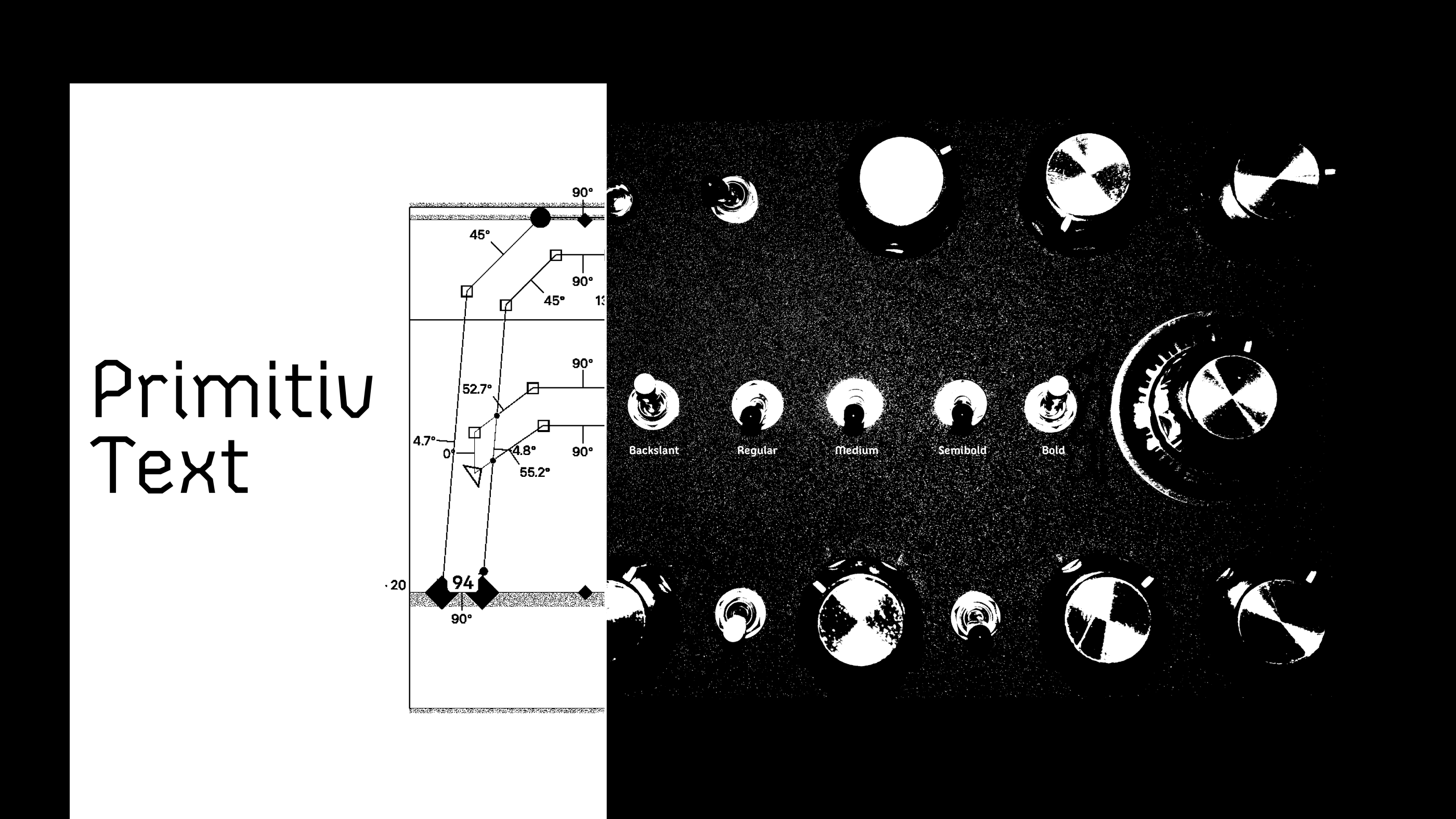
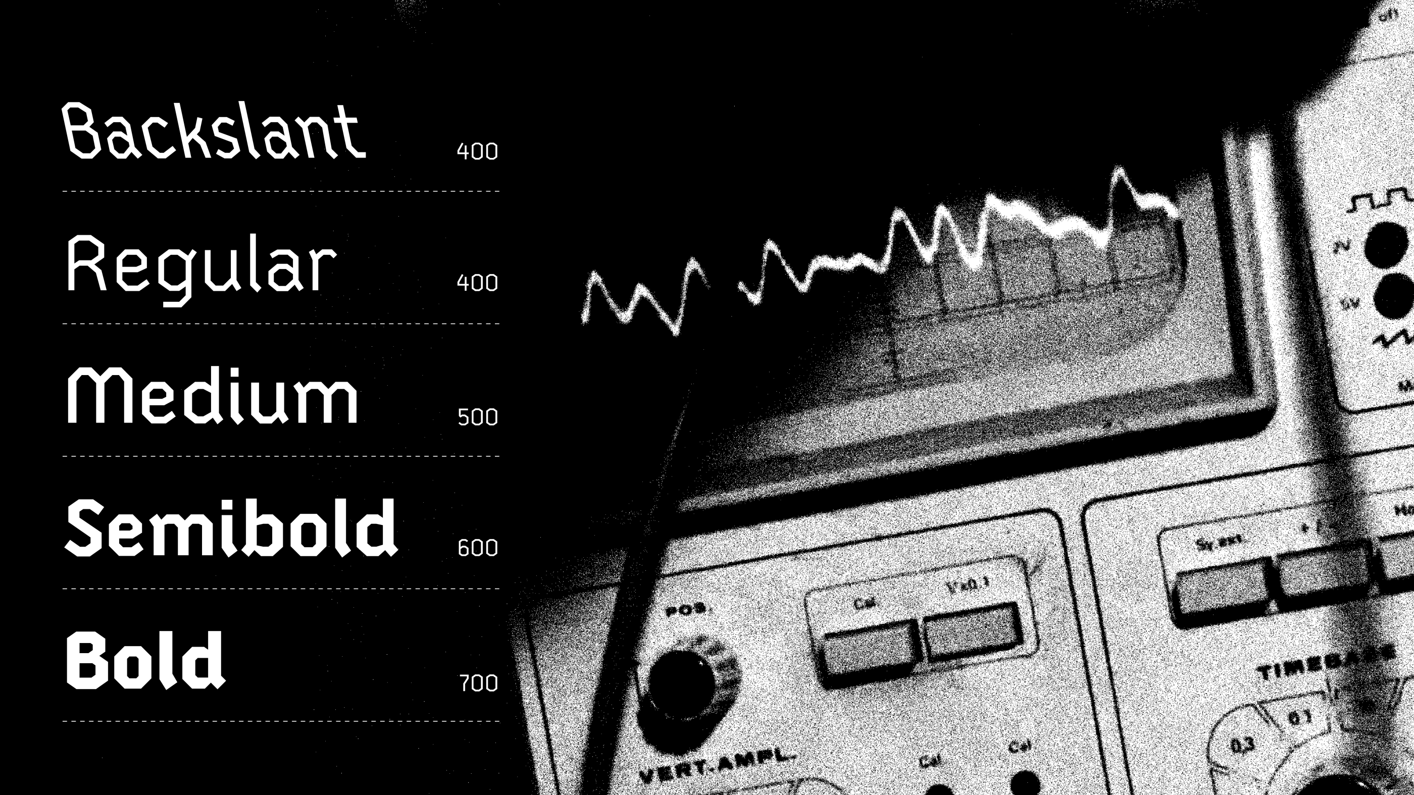
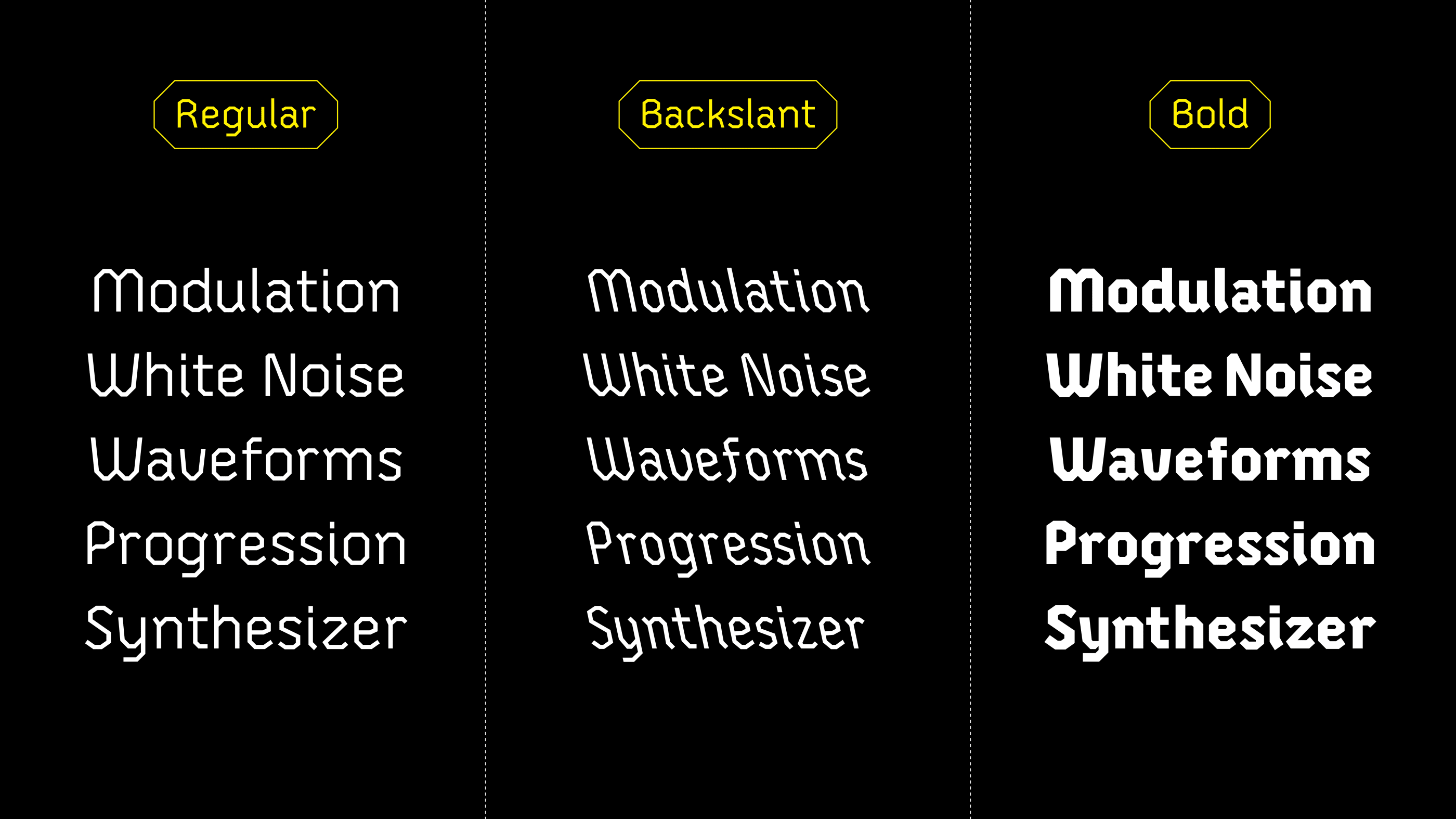
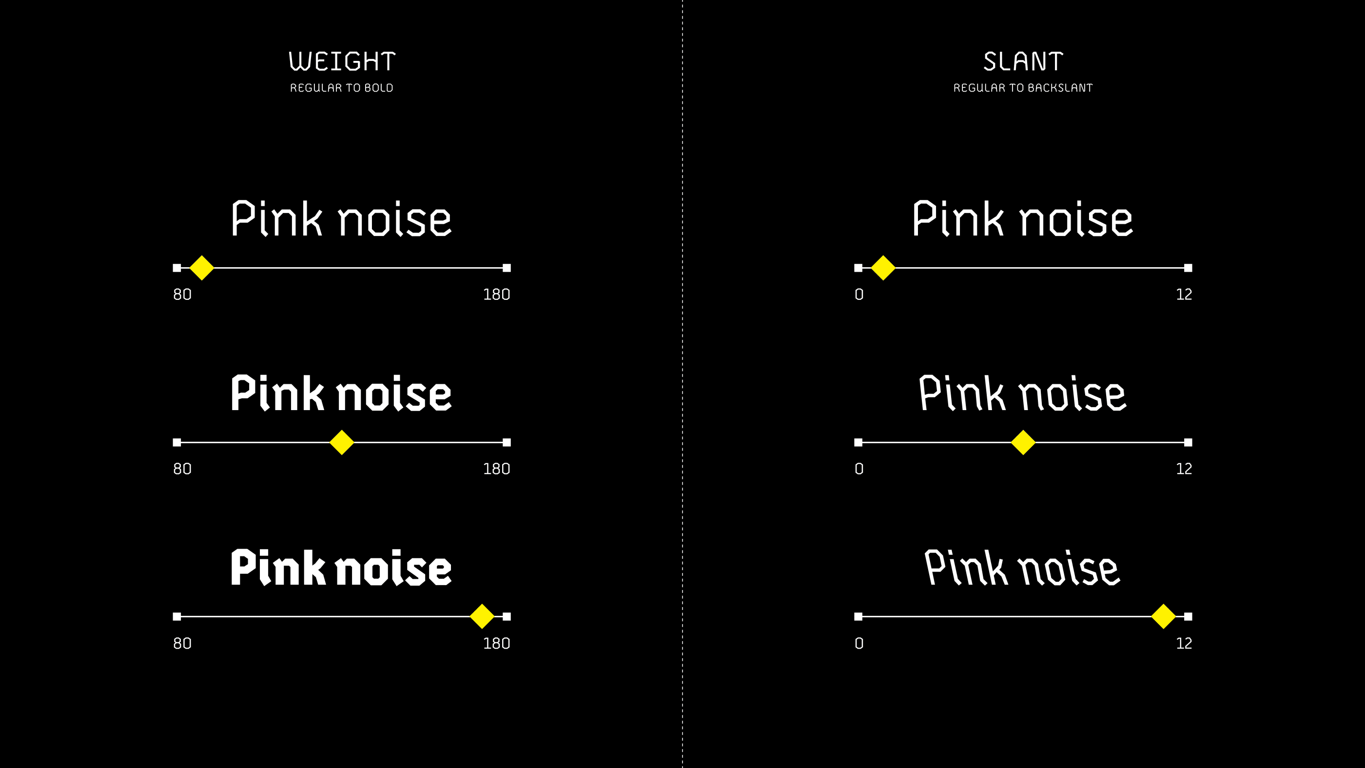
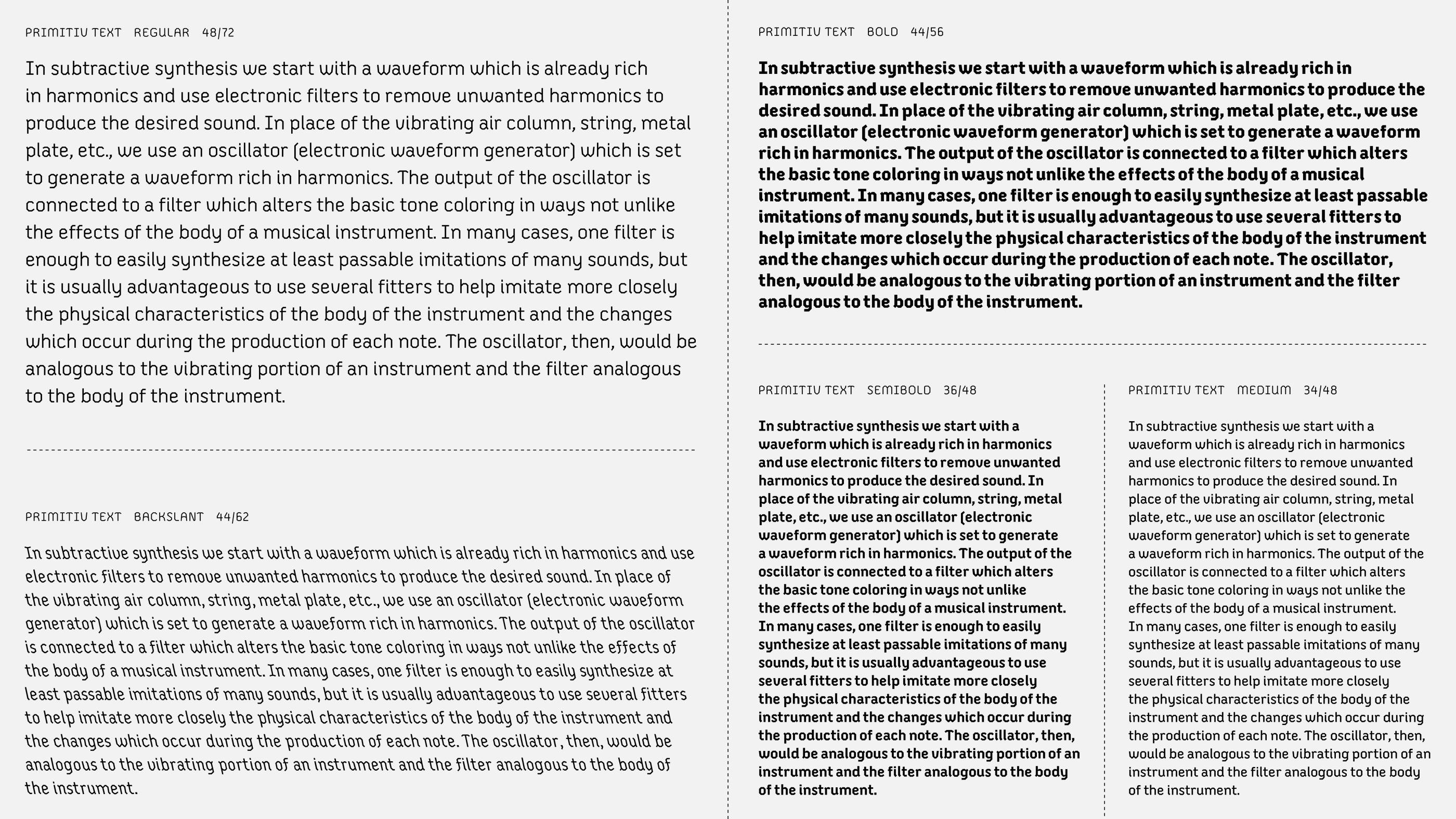
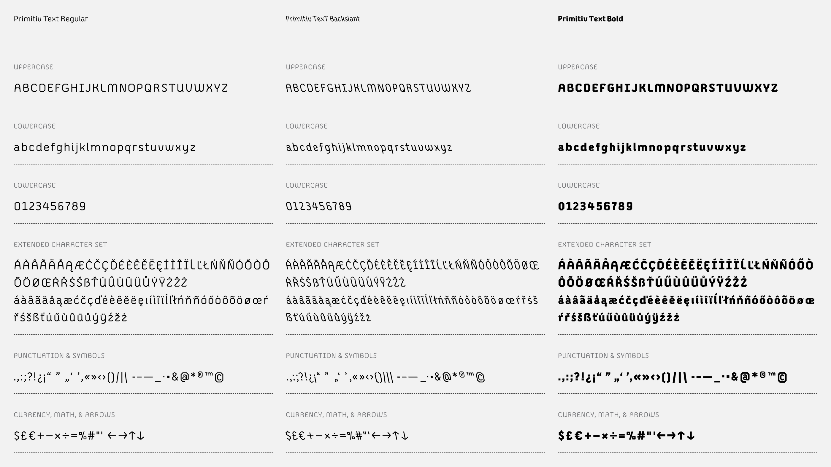
It’s ambitious to turn abstract inspiration rooted from sound into type, but how else does one start an idea for a typeface, especially one with multiple styles? Big and abstract is okay. However, if we focus on foundations and add a few additional objectives to learn from, that makes some of the design decisions easier. For Primitiv Text, the first decision is to create an original text typeface, not based on a revival, and the second is to construct a variable font with interpolated instances. These initial thoughts can be added to the official requirements for Type West, which are: to design a 3-style type family consisting of a regular, bold, and italic. Primitiv Text does this in the form of a regular, bold, and a backslant instead of a traditional italic. Additionally, two new instances are created from interpolation—medium and semibold.
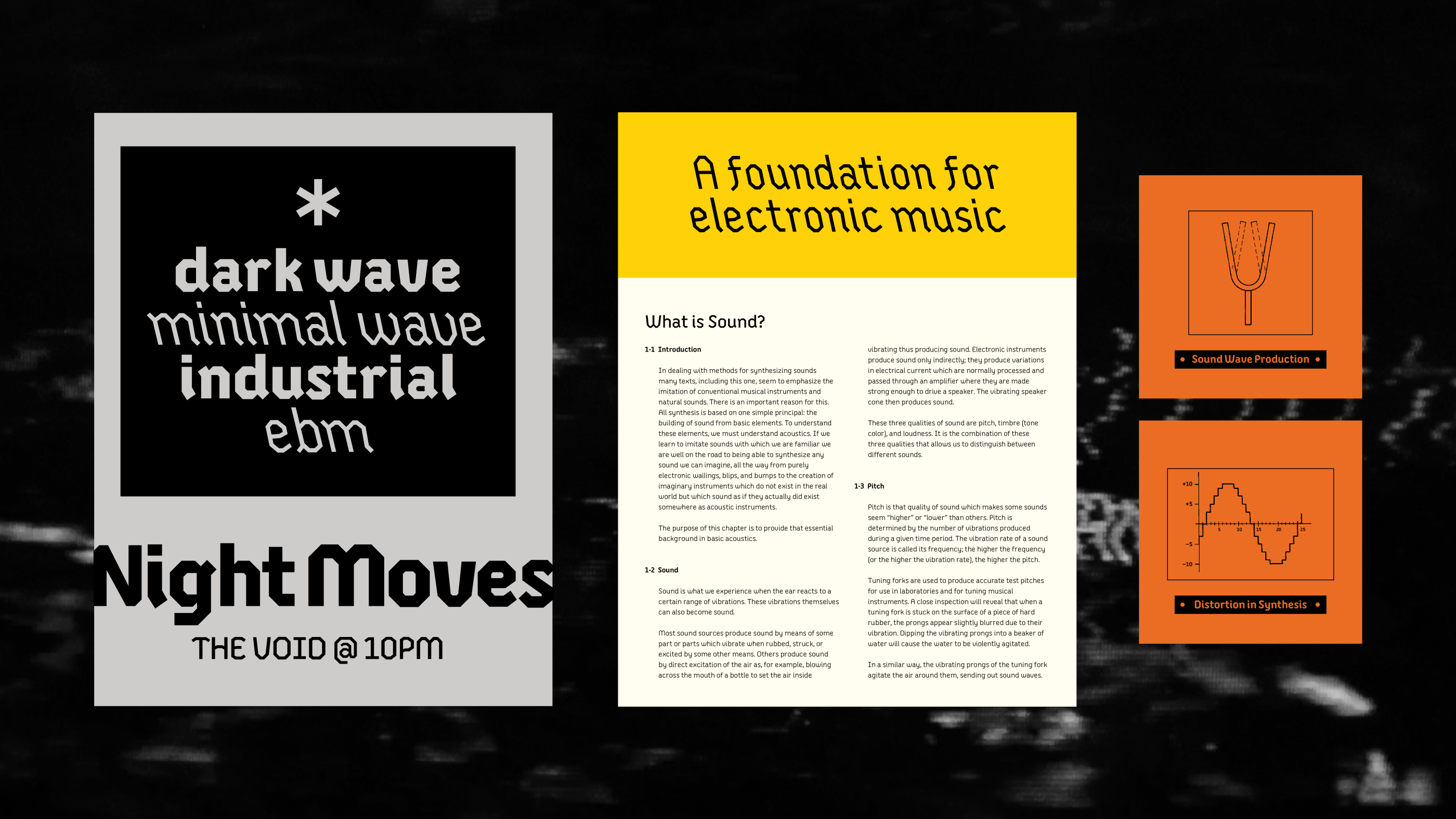
Since the origins for Primitiv Text began with inspiration from electronic music, initial curiosities formed around creating type inspired by old magnetic tape packaging and, relatedly, the early experimental collages of recorded sound of musique concrète, a precursor to electronic music developed by Pierre Schaeffer in the 1940s. However, the challenge seemed too vast and esoteric. I shifted to a more familiar period of the 1970s and 1980s, where electronic music as we know it today was expanding, and experimentation became more accessible and expressive through the use of synthesizers.
Finding inspiration through the lens of early electronic music and its technology and tools became a helpful way to reference and develop the concept that started to form Primitiv Text. Oscilloscopes, oscillators, waveform shapes (especially triangle, sawtooth, and square), synthesizers and their labels and manuals, all came to mind while offering visual guidance outside of traditional design and typographic sources. Together, these formed a helpful starting point to sketch abstract ideas around, without interpretation from music alone.
About the Type
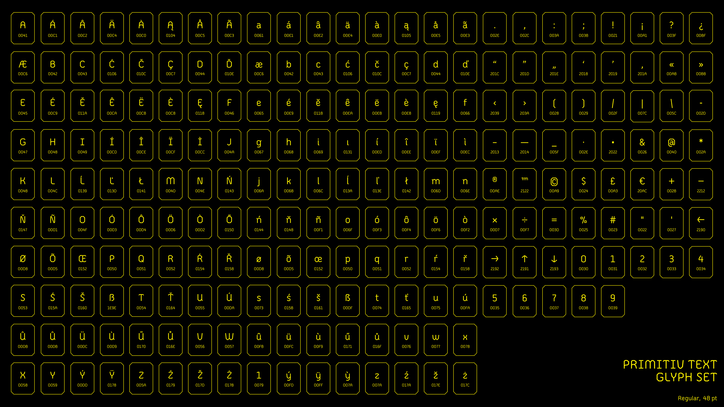
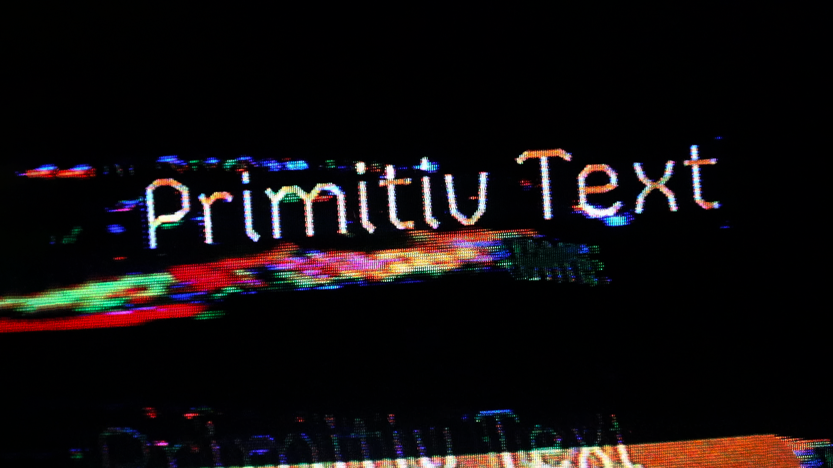
Primitiv Text is a geometric sans serif text typeface with a comfortably noisy texture and primitive forms. It is heavily inspired by fundamental waveform shapes of synthesized sound—triangle, sawtooth, and square waves—visualized through an oscilloscope. Additionally, it pulls inspiration from dense technical synthesizer manuals that describe said machines and how to use them. Primitiv Text is constructed with vertical, horizontal, and diagonal lines to create curves without curves, and includes four weights and a backslant to create a textured reading experience.
Primitiv Text is unavailble and unreleased, for still much work and thorough testing needs to be done. If you wish to help me release this in the future, please be in touch!
Thanks
Primitiv Text was created with the excellent guidance and support of the Type West Online instructors and teaching assistants.
Lead Instructor: Sahar Afshar
Co-Instructor: Fer Cozzi
TAs: Nora Warschewski and Allie Schmitz