Why A Redesign?
In 2023, the in-house brand team at Mixpanel built an extensive and strategic new brand for the 14 year old analytics company. It was a massive undertaking that unfortunately excluded the blog, leaving the blog experience visually neglected from the new Mixpanel website. With that, blog traffic nearly quartered in size since the rebrand.
Redesign Goals
Aside from creating a new visual experience for our readers, we also had some hefty goals that contribute to our company goals at large: to increase pipeline and organic SEO. With this redesign, we also needed to improve blog to signup conversions, remove tech debt, and keep our blog lightweight, manageable, and iterative.
Content Strategy and Design Approach
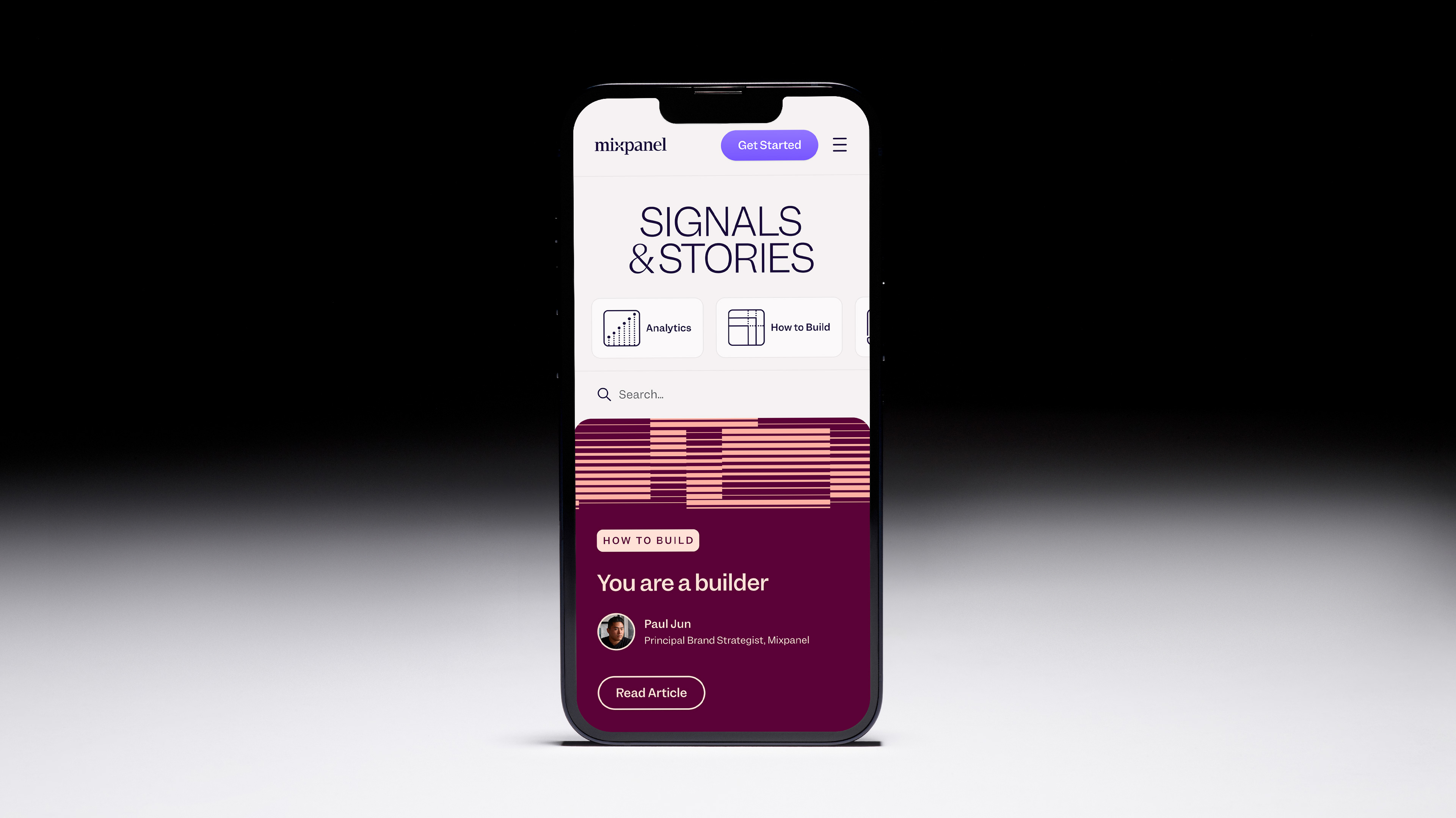
Updating the content strategy of our blog was a focus from the start, with design working directly with brand strategy and the managing editor of the blog. Together, we revisited our approach to our audience, the quality of the articles, existing themes, how tags are used, the frequency in which articles are published—and the name of our blog. We wanted to reframe the way in which we engage with our readers and the stories we want to tell. With that, the name of our blog was changed from The Signal to Signals & Stories.
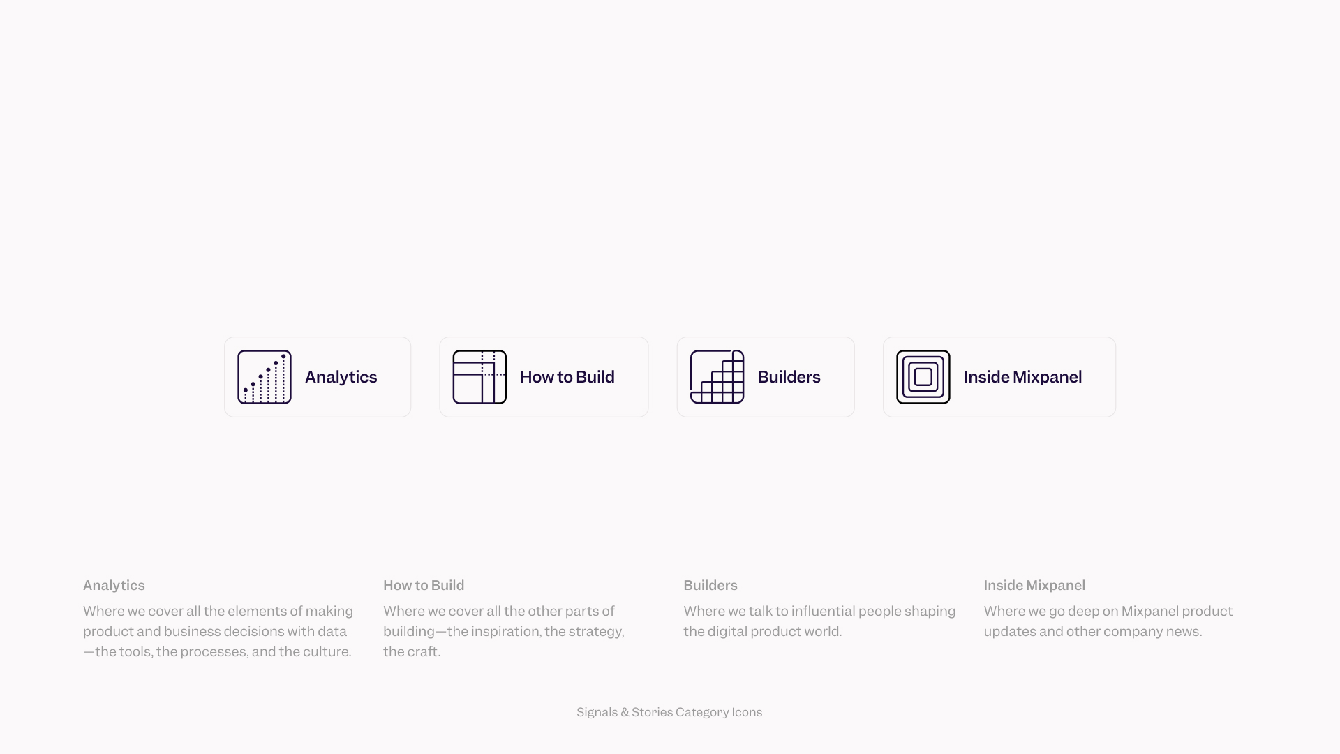
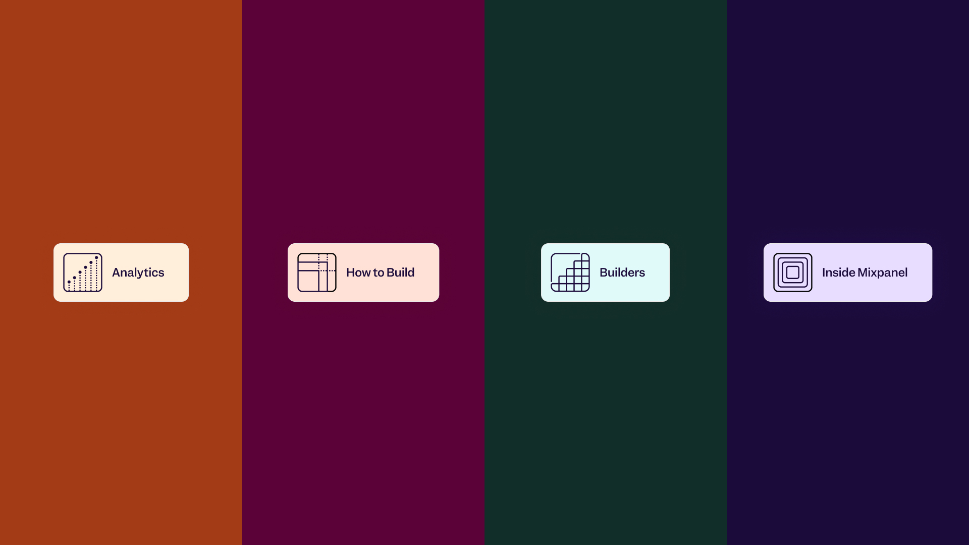
There are four areas of focus within Signals & Stories, each with a category of their own:
Builders: Where we talk with influential people shaping the digital product world
Analytics: Where we cover the elements of making product and business decisions with data—the tools, the processes, and the culture
How to Build: Where we cover all the other parts of building—the inspiration, the strategy, the craft
Inside Mixpanel: Where we go deep on Mixpanel product updates and other company news
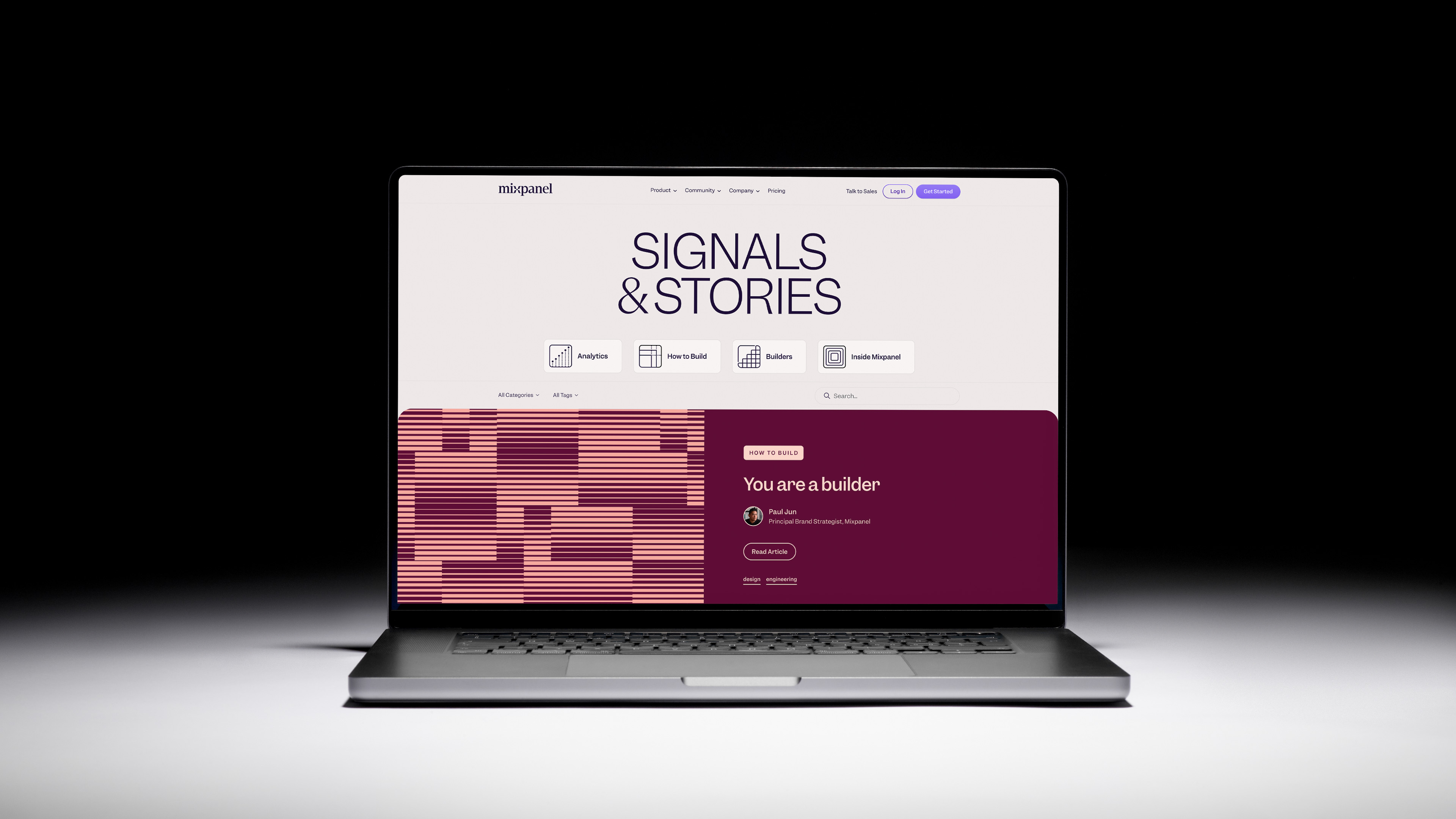
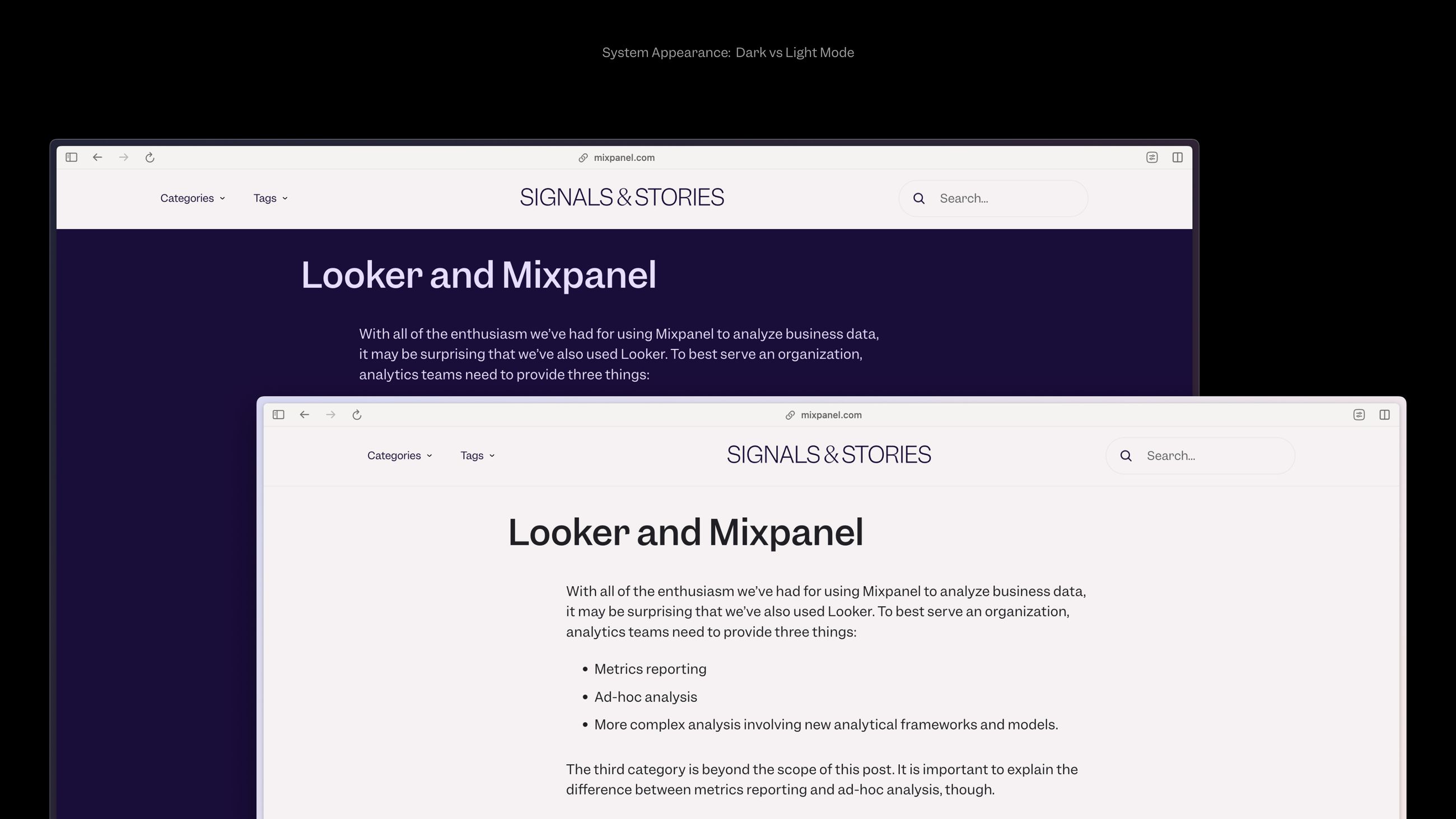
With this updated content structure, we wanted change the way the blog hierarchy was structured. We wanted to lead the hierarchy and make it more focused, while still creating pathways for readers to visit through the use of tags, categories, authors, and search. The structure of the blog is top down and focused on primarily one article at a time, and that is intentional. Aside from creating new categories for stories to live within and directing the hierarchy of the blog, we also built in two article formats to separate articles and interviews, using slightly different typography that's part of our larger type system.
Editorial Artwork
Imagery was another area of decision making and a major part of the redesign. Throughout the years, the Mixpanel blog primarily relied on custom illustration made for each blog post that depicted the article. Though this makes sense for editorial platforms, it didn't make sense for Mixpanel. The custom illustrations were a major time suck and challenging to create, especially for topics that are so abstract in nature like analytics—how many times can you draw a chart without dying inside? How do you visually capture that concept with a custom illustration every time? This put the blog artwork in the hands of a few talented designers who always had this extra work on their plate that kinda sucked.
With the new approach to the blog and an increased publishing cadence, the system is built with different header types so imagery isn't even necessary to publish a piece. But it also allows for more variety of artwork types: illustration, pattern, and a headshot (with a pattern) and non-artwork types: text only headline, or a pull quote.
The patterns are created with a procedural and technical approach, and are as abstract as data itself but visually captivating, beautiful, and actually fun to make! This allows for anyone on the design team to make artwork for the blog if they want out of a system of patterns, rather than relying on those who have more illustrative skillsets.
Tech Build
The blog wasn't just completely reframed from an editorial content and artwork perspective, or redesigned with our brand system in a new light—it was also completely overhauled by the interactive engineering team to give us a new CMS. It was rebuilt with a headless CMS structure and built with improved performance and flexibility in mind, utilizing sharable react components to integrate with our existing design system. The new CMS makes it easy for designers and editors to dive in, upload assets, and publish new articles.
Results for Signals & Stories
74% Increase in views from September 2023 to August 2024
[Post-Mixpanel rebrand vs post-blog redesign]
29K Increase in blog visits from May 2024 to August 2024
[Pre-launch vs post-launch]
33% Increase in readers who viewed a second blog within 30 days
[Aug–Dec '23 vs June–Aug '24]
50% Increase in readers who viewed a second blog in the same visit
[Aug–Dec '23 vs June–Aug '24]
38% Increase in organic hand raisers from May to June 2024
[Pre-blog launch vs post-blog launch]
Blog Team
This was quite the large project and had so many moving parts, I'm thrilled to have worked on this project with a fantastic team. Though it is published here, the work is still ongoing and will only improve from what's shown here! Thank you to my talented teammates and collaborators:
Interactive PM: Isha Mehra
Engineering Manager: Jess Wolvington
Content Lead: Dan Bean
Brand Strategy: Paul Jun
Art Direction and Design Lead: Annie Szafranski
Editorial Art System Design: Erik Blad
Engineering Lead: Lindsey Bradford
Engineers: Erik Erikson, Tiffany Qi, Jun Kim
Design Review: Alex Coleman, Vijay Jayaram, Mike Casebolt, Alex Shepherd, and
the brand and interactive design team!

