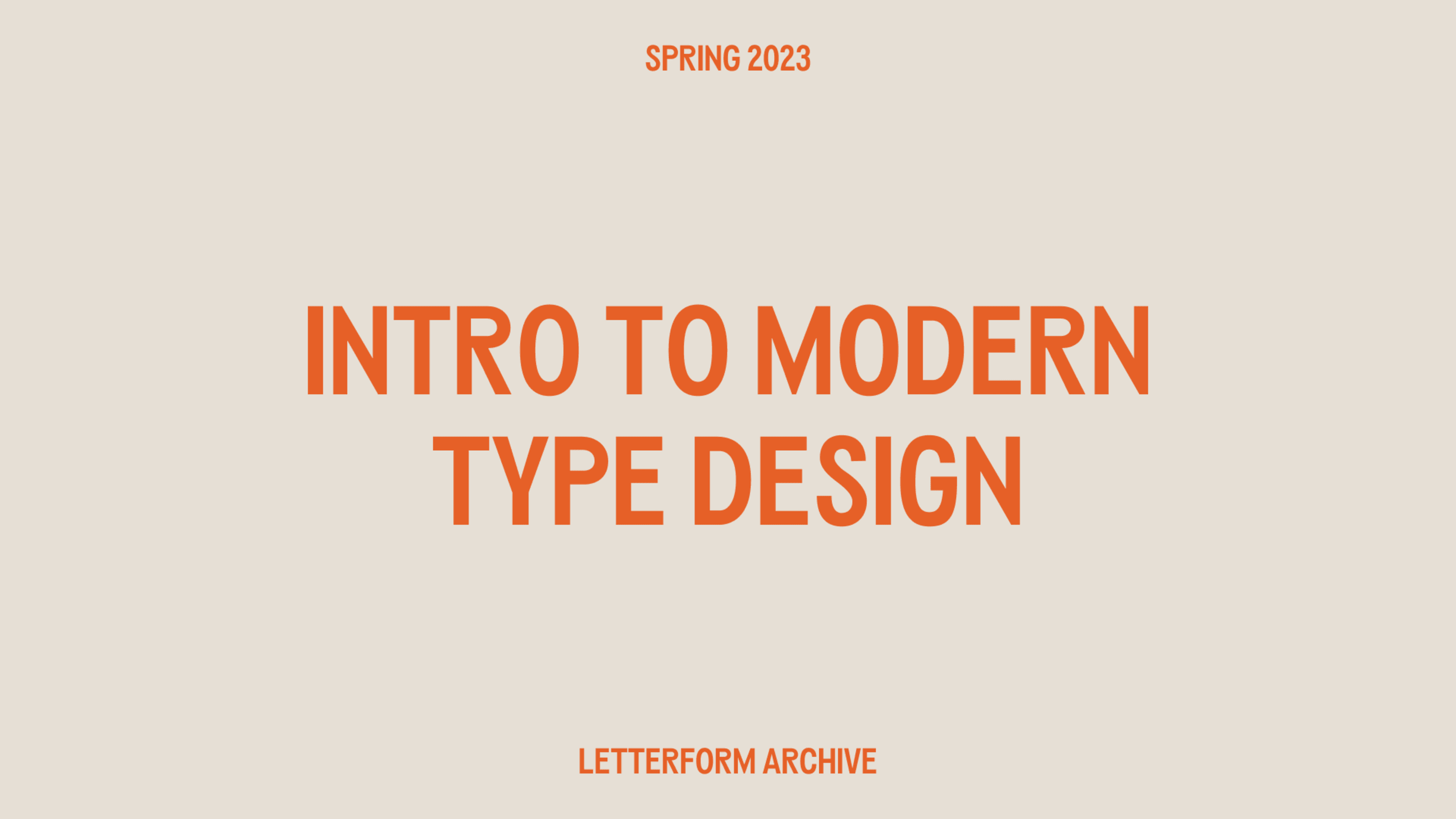
About the Project
To kick off 2023, I signed up for a 10-week type design workshop, Introduction to Modern Type Design, through the Letterform Archive. It was my first official Letterform Archive workshop after years of support from afar, and also the first workshop I've taken specific to type design. Kel Troughton of Overlap Type taught the class, along with James Plattner, who TA'd (he also just released Outgo through Overlap Type). We had some lovely surprise guests towards the end of the workshop, like Libbie Bischoff of Type Du Nord and James Edmondson of OhnoTypeCo—super inspiring!
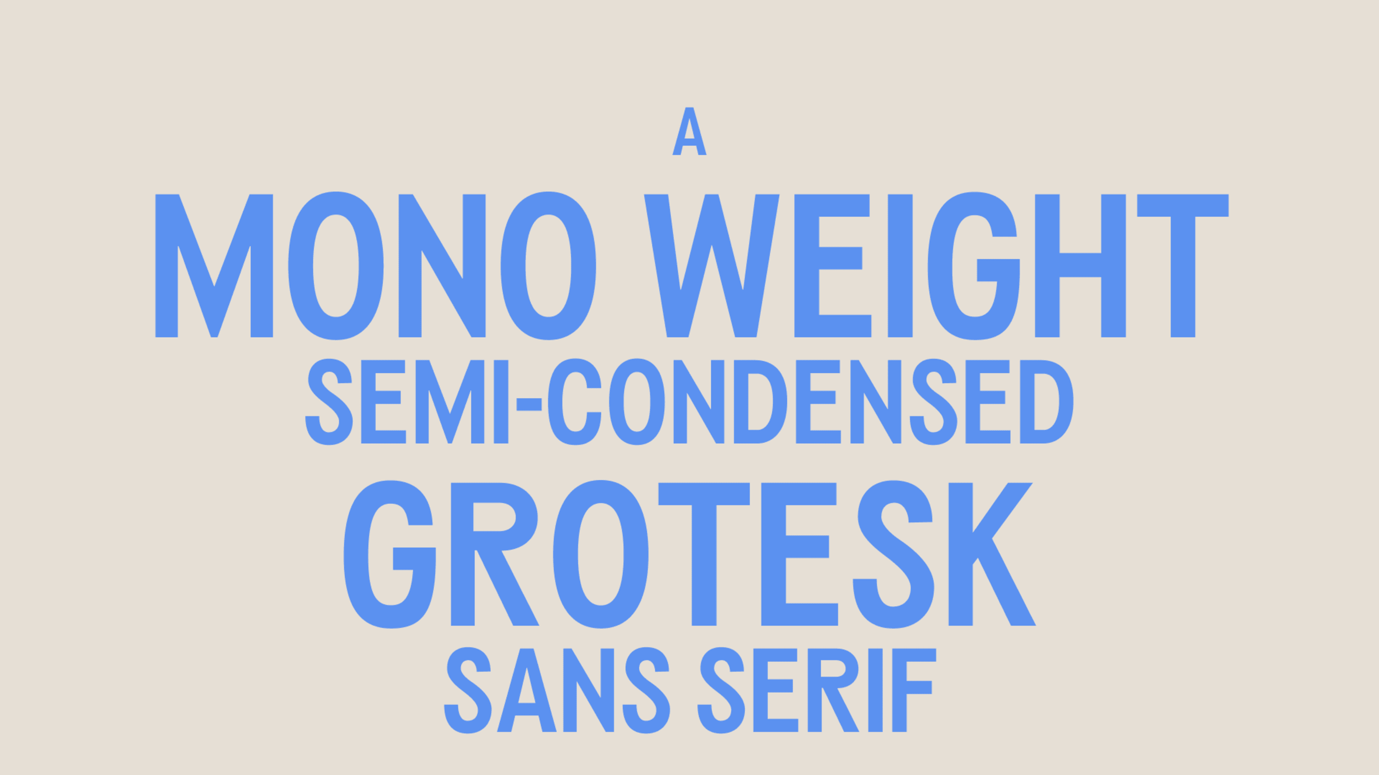
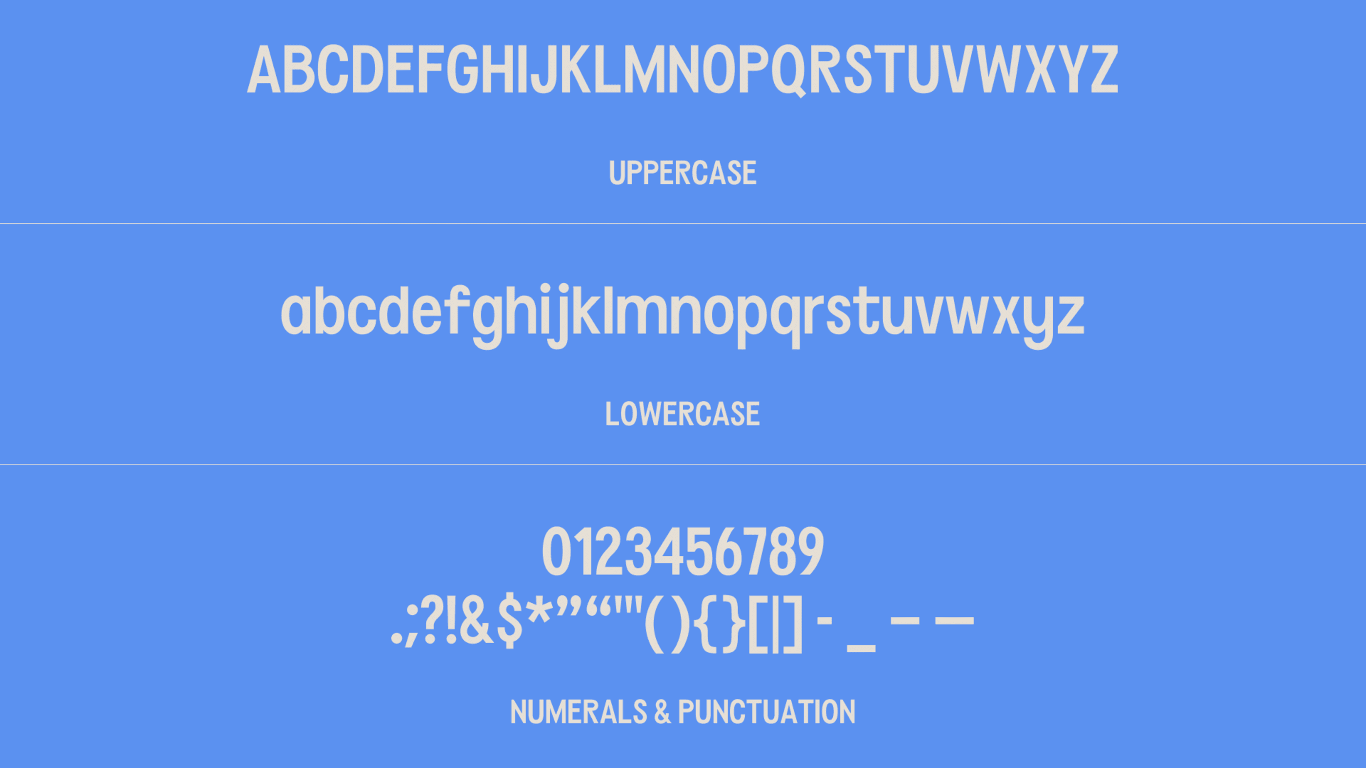
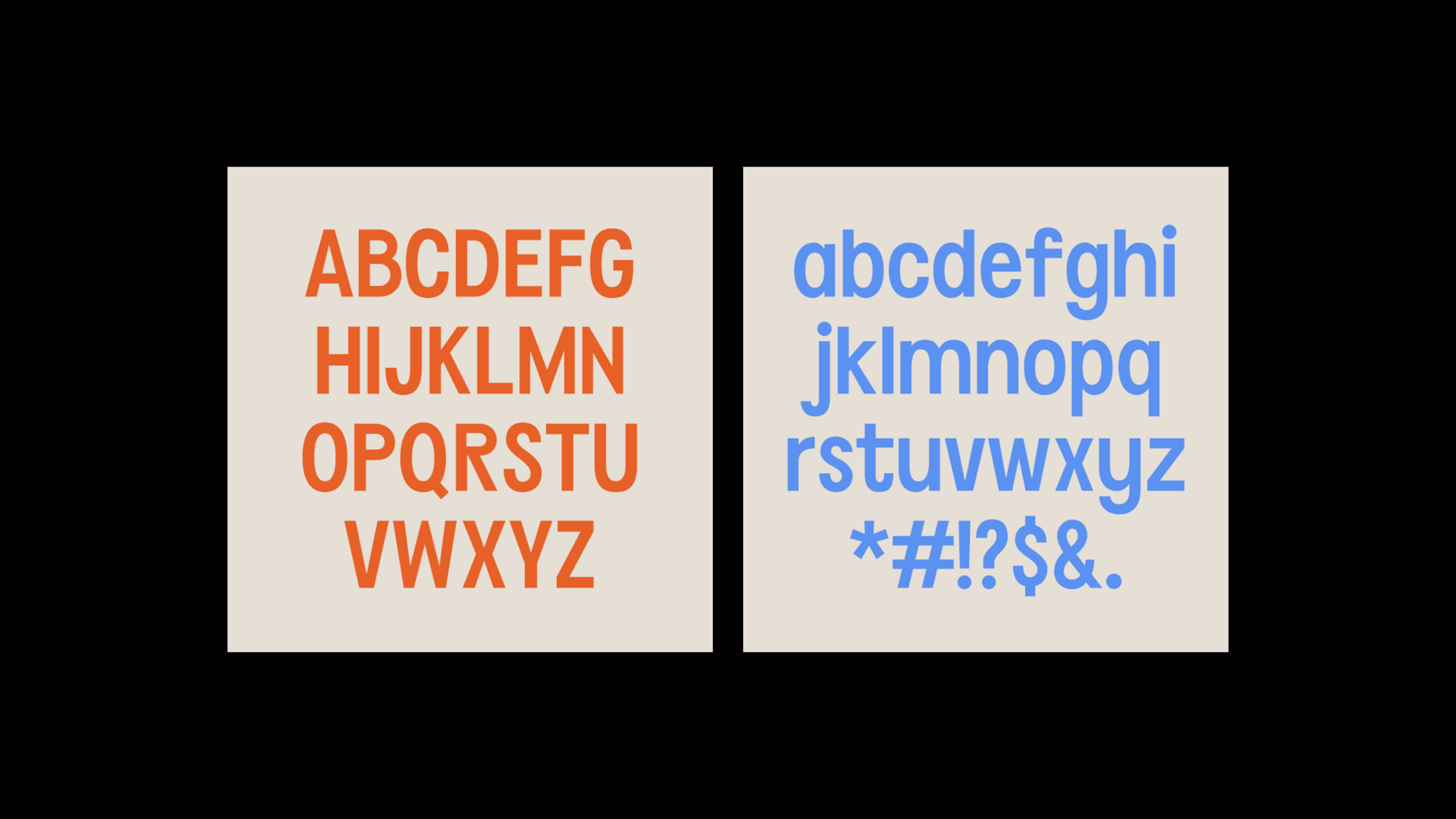
The goal of the IMTD workshop was to get our feet wet in the world of type design and finish the workshop with a type concept of our own and a basic glyph set. Due to the level and length of the course, we weren't expected to finish with a completed type family. Instead, we'd have all the uppercase and lowercase letterforms, numerals, and select glyphs—whatever we had time for—in a single weight.
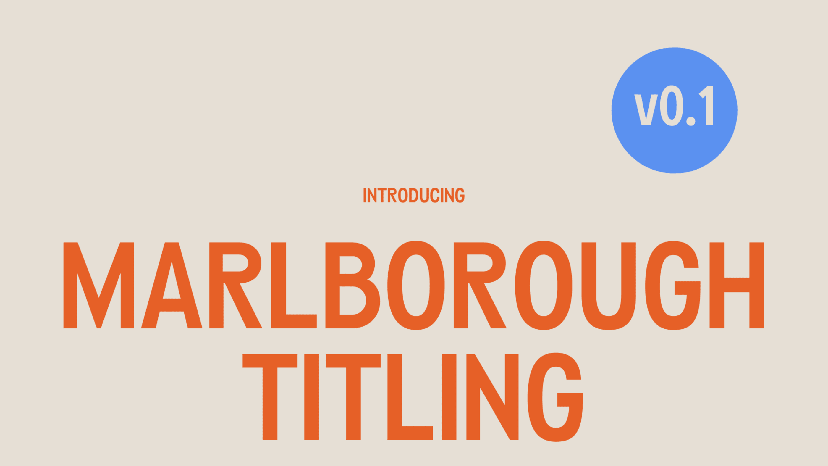
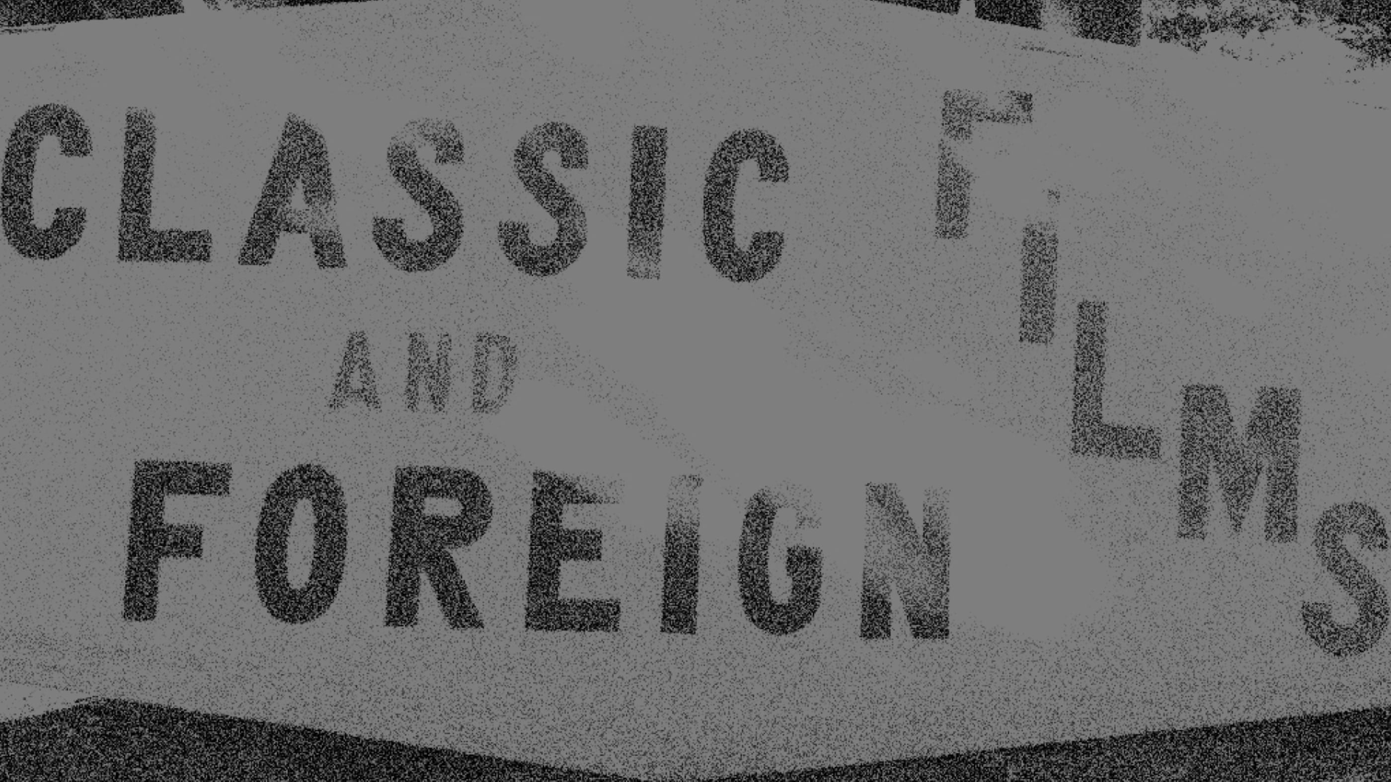
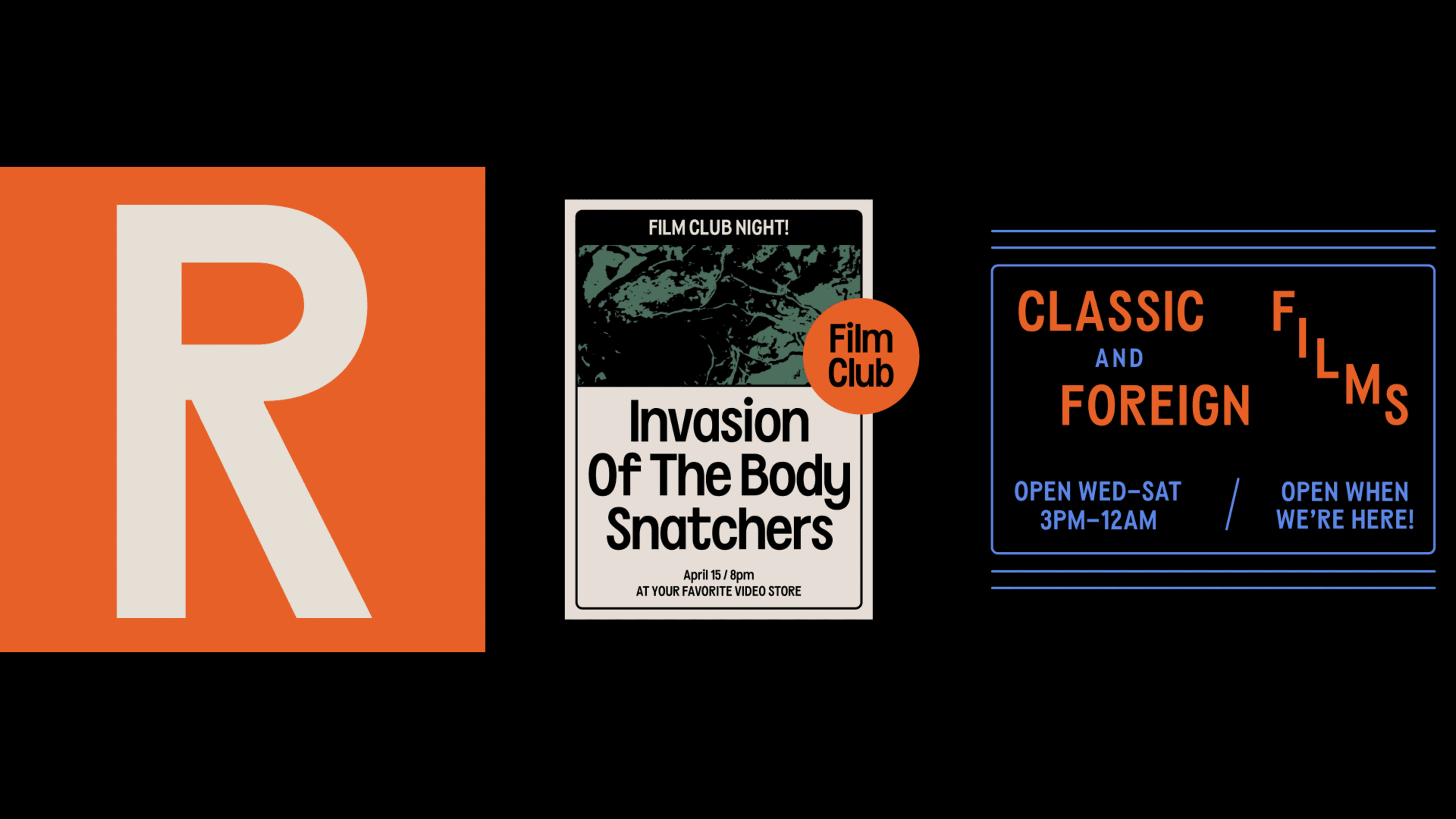
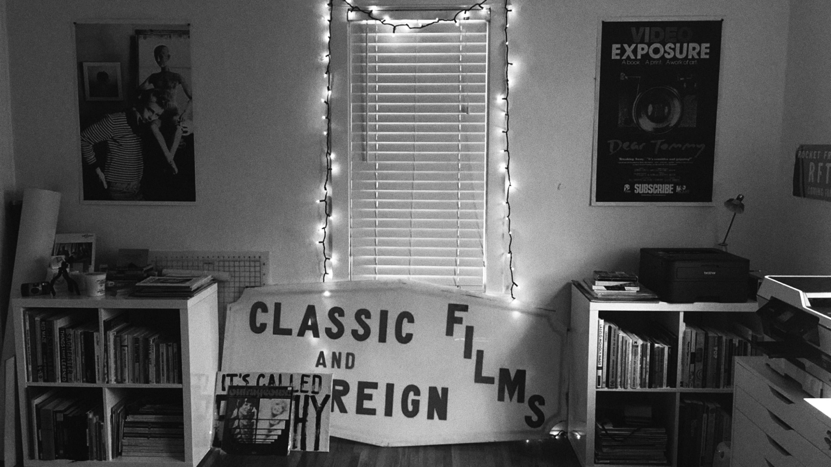
Thus, Marlborough Titling (v0.1) was born! Marlborough Titling is shamelessly inspired by an old hand painted sign from a local video store that shut down years ago—Kensington Video. I have been obsessed with the sign and fortunately had the pleasure of meeting the person who hand-painted it for their family-owned business many years ago. The name comes from the street where it was painted.
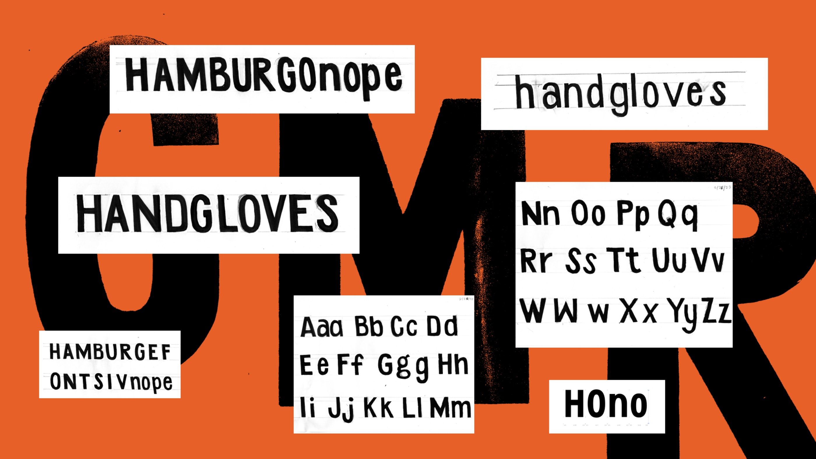
Working on Marlborough Titling has been wonderful and exciting. It was challenging, of course, but also a valuable learning experience for a graphic designer who has worked closely with type for years. Some of the biggest challenges for me, were getting the weights balanced on all the characters—especially between uppercase and lowercase letters. Setting the spacing and creating the punctuation were also a challenge, so a good amount of it was a struggle each week.
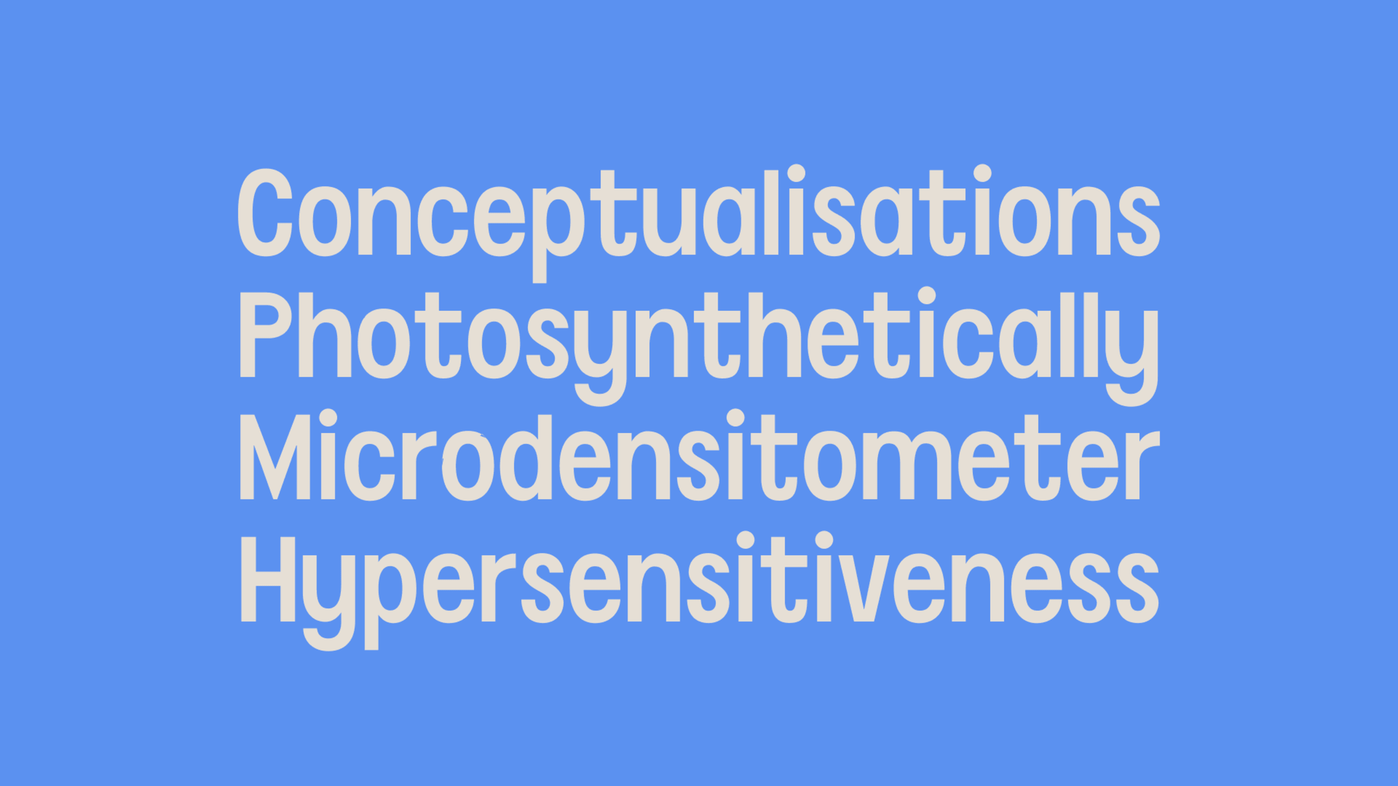
One of my favorite aspects of this project was envisioning and creating the lowercase character set out of reference material that only included uppercase letters. Thinking about the specific qualities that made up my source material, and therefore helped inform Marlborough Titling, was an exercise in studying letterforms and their characteristics closely; it felt like solving a mystery of what those new letters would look like based on the clues I did have to complete the system.
I hope to jump back into creating Marlborough Titling soon and finish the regular weight with a more extensive glyph set. Though I am interested in seeing this project in other weights, the scope will most likely stay fairly limited since this is my first type design project.